


# CustomTkinter
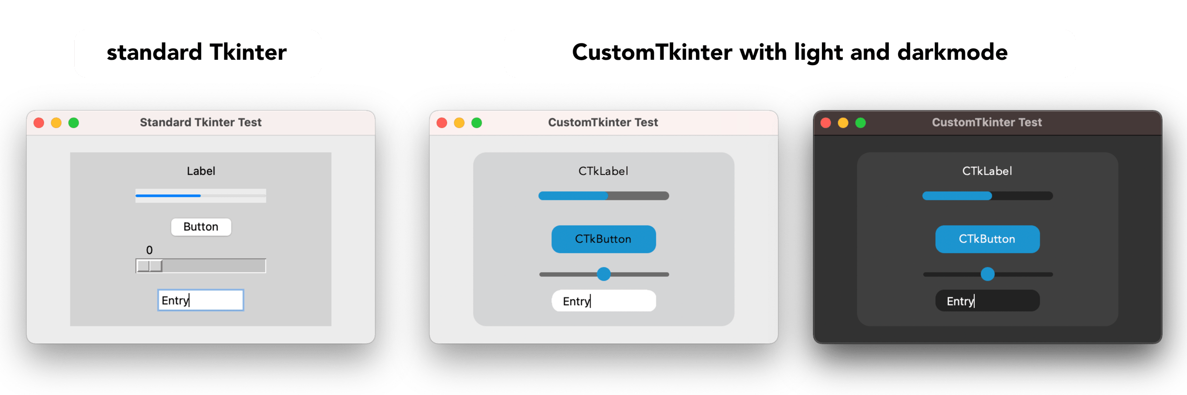
With CustomTkinter you can create modern looking user
interfaces in python with tkinter. CustomTkinter is a
tkinter extension which provides extra ui-elements like
the CTkButton, which can be used like a normal tkinter.Button,
but can be customized with a border and round edges.
CustomTkinter also supports a light and dark theme,
which can either be set manually or get controlled by
the system appearance mode.
### Installation
To use CustomTkinter, just place the /customtkinter folder from this repository
next to your program, or **install the module with pip**:
```
pip3 install customtkinter
```
**Update existing installation:** ```pip3 install customtkinter --upgrade```\
(from time to time bugs are getting fixed and new features are added)
PyPI: https://pypi.org/project/customtkinter/
### Example program (simple button):
To test customtkinter you can try this simple example with only a single button:
```python
import tkinter
import customtkinter # <- import the CustomTkinter module
root_tk = customtkinter.CTk() # create CTk window like you do with the Tk window (you can also use normal tkinter.Tk window)
root_tk.geometry("400x240")
root_tk.title("CustomTkinter Test")
def button_function():
print("button pressed")
# Use CTkButton instead of tkinter Button
button = customtkinter.CTkButton(master=root_tk, corner_radius=10, command=button_function)
button.place(relx=0.5, rely=0.5, anchor=tkinter.CENTER)
root_tk.mainloop()
```
which gives the following:
### Use custom colors and shapes:
If you dont specify any colors, customtkinter uses the standard blue color in the light theme.
You can change the color theme to dark by calling
```customtkinter.set_appearance_mode("Dark")```.
If you specify custom colors for CustomTkinter elements, the you can either use a
tuple in the form: (light_color, dark_color). Or you can set a single color
which will be used in light and dark theme.
```python
customtkinter.set_appearance_mode("Dark") # Other: "Light", "System"
button = customtkinter.CTkButton(master=root_tk,
fg_color=("black", "lightgray"), # <- tuple color for light and dark theme
text="CTkButton",
command=button_event)
button.place(relx=0.5, rely=0.5, anchor=tkinter.CENTER)
```
### Dark mode and dark title-bar on macOS
If you have a python version with Tcl/Tk >= 8.6.9, then you automatically get
a dark title bar with macOS dark-mode on, if you use the `customtkinter.Ctk` class to create
the window instead of the normal `tkinterTk` class. Currently, only the anaconda python versions have Tcl/Tk >= 8.6.9.
So if you want a dark window title-bar, you have to install anaconda python version
or miniconda.
```python
import tkinter
import customtkinter
customtkinter.set_appearance_mode("System")
root_tk = customtkinter.CTk()
... the program ...
root_tk.mainloop()
```
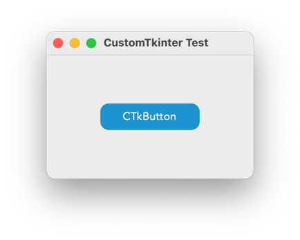
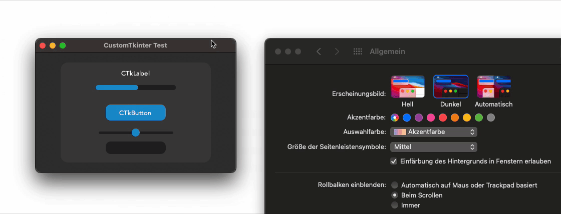
The above results in a window with a black title-bar with macOS dark-mode turned on:
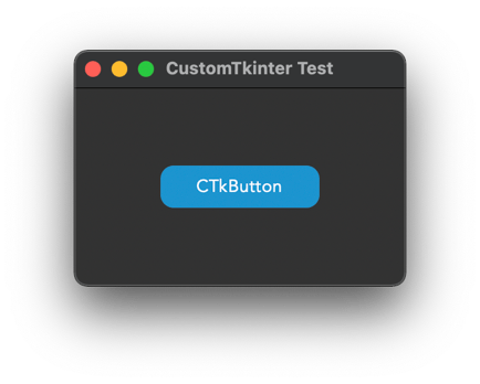
If you set the appearance mode to "System", it should change with
the System mode:
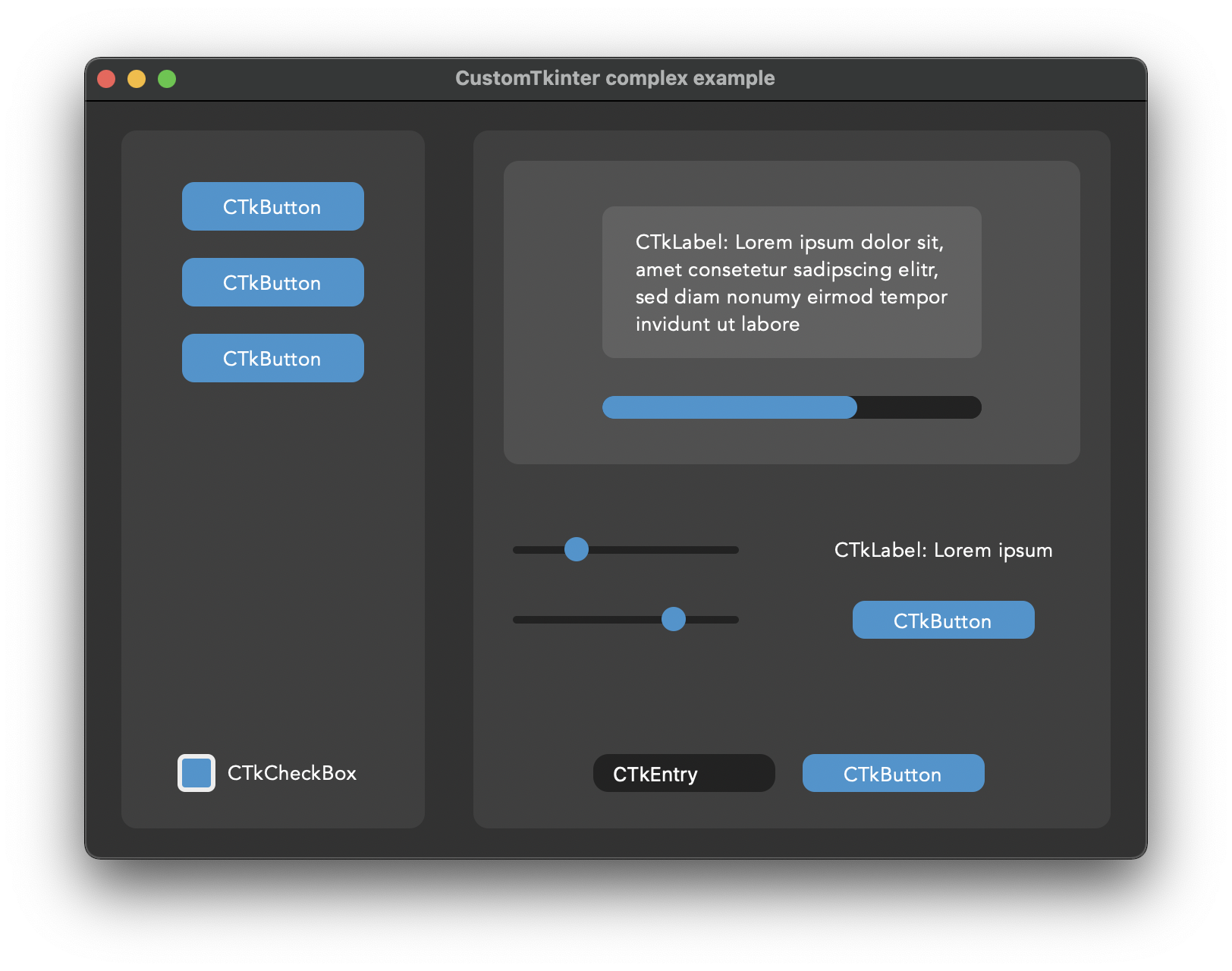
### Advanced example with multiple CTkFrames
Here I used the ``customtkinter.CTk()`` class to create the main window with two CTkFrame's and
set the appearance mode to `System`. It has some
kind of a menu on the left side, and I used all CustomTkinter elements
there are at the moment.Maybe this is a good reference if you want to
create your own application with this library.
(Code: /complex_example.py)
With macOS dark-mode turned on, it looks like this:
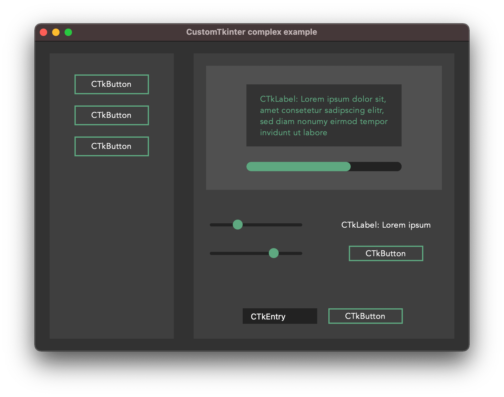
But you can also customize it by yourself. Here I changed the main
colors and removed the round corners, and added a border to the buttons:
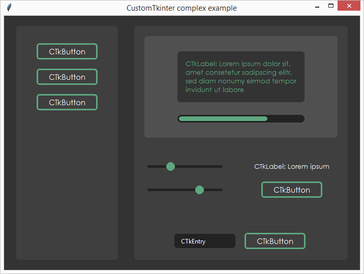
### CustomTkinter on Windows/Linux
All elements of Customtkinter are drawn on the ```tkinter.Canvas```.
But the Tkinter canvas supports antialiasing only on macOS, so on Windows
and Linux the elements are rendered in a much worse quality. So you have
to experiment with the ```corner_radius``` and look when the rounded corners
look best. I tried to design the too complex example programs so that they
also look acceptable on Windows. Maybe you can use the parameters for
```corner_radius``` and ```width``` for your program as well.
Example 1:```examples/complex_example.py```
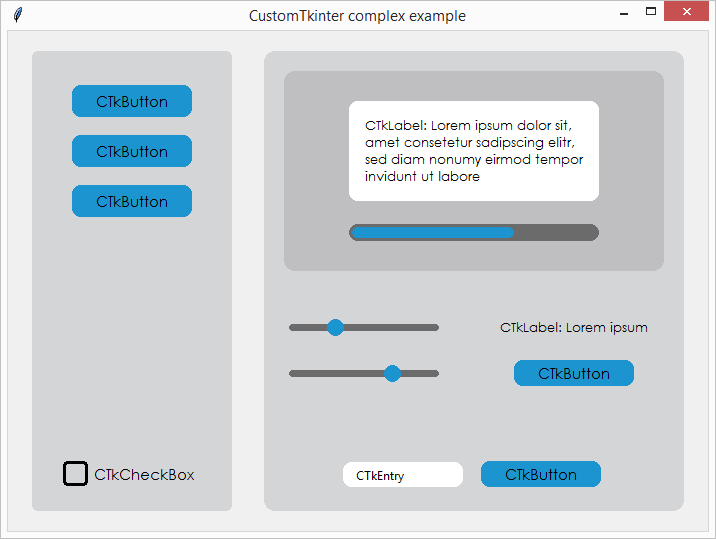
Example 2: ```examples/complex_example_other_style.py```
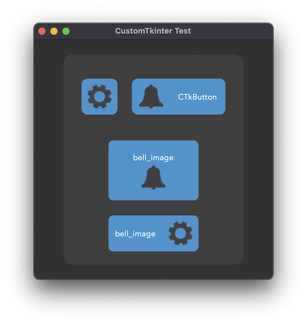
### CTkButton with images
It's also possible to put an image on a CTkButton. You just have to
pass a PhotoImage object to the CTkButton with the argument ``image``.
If you want no text at all you have to set ``text=""`` or with the ``compound``
option you can specify how to position both the text and image at once.
You can find an example program ( /simple_test_images.py ), where I
created two buttons with a bell and a settings image on them:
### Integration of TkinterMapView widget
In the following example I used a TkinterMapView which integrates
well with a CustomTkinter program. It's a tile based map widget which displays
OpenStreetMap or other tile based maps:
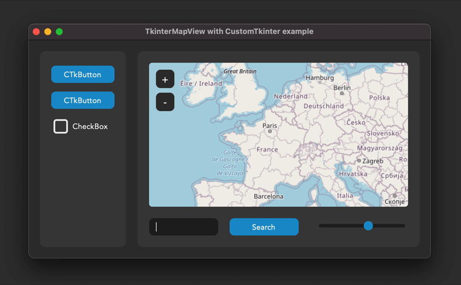
You can find the TkinterMapView library and the example program here:
https://github.com/TomSchimansky/TkinterMapView
# Documentation - CustomTkinter Elements
### CTk
You can use the normal ``tkinter.Tk`` class to create the root window,
but if you want a background color that changes with the appearance mode and a dark title-bar on macOS,
you should use the `customtkinter.CTk` class which behaves exactly like the normal Tk
class, except that you can also set a tuple color as bg color.
Example Code:
```python
root_tk = customtkinter.CTk()
... program ...
root_tk.mainloop()
```
Show all arguments:
argument | value
--- | ---
bg_color or bg | tuple: (light_color, dark_color) or single color
CTk Methods:
```python
root_tk = customtkinter.CTk()
# configure bg color with single or tuple color
root_tk.configure(bg_color="gray20")
root_tk.configure(bg_color=(, ))
```
### CTkFrame
Example Code:
```python
frame = customtkinter.CTkFrame(master=root_tk,
width=200,
height=200,
corner_radius=10)
frame.place(relx=0.5, rely=0.5, anchor=tkinter.CENTER)
```
Show all arguments:
argument | value
--- | ---
master | root, tkinter.Frame or CTkFrame
width | slider width in px
height | slider height in px
fg_color | forground color, tuple: (light_color, dark_color) or single color
bg_color | background color, tuple: (light_color, dark_color) or single color
### CTkButton
Examle Code:
```python
def button_event():
print("button pressed")
button = customtkinter.CTkButton(master=root_tk,
text="CTkButton",
command=button_event,
width=120,
height=32,
border_width=0,
corner_radius=8)
button.place(relx=0.5, rely=0.5, anchor=tkinter.CENTER)
```
Show all arguments:
argument | value
--- | ---
master | root, tkinter.Frame or CTkFrame
text | string
command | callback function
width | button width in px
height | button height in px
corner_radius | corner radius in px
border_width | button border width in px
fg_color | forground color, tuple: (light_color, dark_color) or single color
bg_color | background color, tuple: (light_color, dark_color) or single color
border_color | border color, tuple: (light_color, dark_color) or single color
hover_color | hover color, tuple: (light_color, dark_color) or single color
text_color | text color, tuple: (light_color, dark_color) or single color
text_font | button text font, tuple: (font_name, size)
hover | enable/disable hover effect: True, False
image | put an image on the button, removes the text, must be class PhotoImage
compound | set image orientation if image and text are given ("top", "left", "bottom", "right")
state | tkinter.NORMAL (standard) or tkinter.DISABLED (not clickable, darker color)
CTkButton Methods:
```python
CTkButton.set_text(new_text)
CTkButton.set_image(new_image)
CTkButton.configure(text=new_text)
CTkButton.configure(bg_color=new_bg_color,
fg_color=new_fg_color,
hover_color=new_hover_color,
text_color=new_text_color)
CTkButton.configure(state=tkinter.DISABLED)
CTkButton.configure(state=tkinter.NORMAL)
button_state = CTkButton.state
```
### CTkLabel
Example Code:
```python
label = customtkinter.CTkLabel(master=root_tk,
text="CTkLabel",
width=120,
height=25,
corner_radius=8)
label.place(relx=0.5, rely=0.5, anchor=tkinter.CENTER)
```
Show all arguments:
argument | value
--- | ---
master | root, tkinter.Frame or CTkFrame
text | string
width | label width in px
height | label height in px
corner_radius | corner radius in px
fg_color | forground color, tuple: (light_color, dark_color) or single color
bg_color | background color, tuple: (light_color, dark_color) or single color, None for transparent bg
text_color | label text color, tuple: (light_color, dark_color) or single color
text_font | label text font, tuple: (font_name, size)
CTkLabel Methods:
```python
CTkLabel.configure(text=new_text)
CTkLabel.configure(fg_color=new_fg_color,
bg_color=new_bg_color,
text_color=new_text_color)
```
### CTkEntry
Example Code:
```python
entry = customtkinter.CTkEntry(master=root_tk,
width=120,
height=25,
corner_radius=10)
entry.place(relx=0.5, rely=0.5, anchor=tkinter.CENTER)
text = entry.get()
```
Show all arguments:
argument | value
--- | ---
master | root, tkinter.Frame or CTkFrame
width | entry width in px
height | entry height in px
corner_radius | corner radius in px
fg_color | forground color, tuple: (light_color, dark_color) or single color
bg_color | background color, tuple: (light_color, dark_color) or single color
text_color | entry text color, tuple: (light_color, dark_color) or single color
text_font | entry text font, tuple: (font_name, size)
CTkEntry Methods:
```python
CTkEntry.delete(...) # standard tkinter Entry...
CTkEntry.insert(...)
text = CTkEntry.get()
```
### CTkCheckBox
Examle Code:
```python
checkbox = customtkinter.CTkCheckBox(master=root_tk,
text="CTkCheckBox")
checkbox.place(relx=0.5, rely=0.5, anchor=tkinter.CENTER)
```
Show all arguments:
argument | value
--- | ---
master | root, tkinter.Frame or CTkFrame
text | string
width | box width in px
height | box height in px
corner_radius | corner radius in px
border_width | box border width in px
fg_color | forground (inside) color, tuple: (light_color, dark_color) or single color
bg_color | background color, tuple: (light_color, dark_color) or single color
border_color | border color, tuple: (light_color, dark_color) or single color
hover_color | hover color, tuple: (light_color, dark_color) or single color
text_color | text color, tuple: (light_color, dark_color) or single color
text_font | button text font, tuple: (font_name, size)
hover | enable/disable hover effect: True, False
state | tkinter.NORMAL (standard) or tkinter.DISABLED (not clickable, darker color)
CTkCheckBox Methods:
```python
CTkCheckBox.get() # 1 or 0 (checked or not checked)
CTkCheckBox.select() # turns on checkbox
CTkCheckBox.deselect() # turns off checkbox
CTkCheckBox.toggle() # change check state of checkbox
CTkCheckBox.configure(text=new_text)
CTkCheckBox.configure(bg_color=new_bg_color,
fg_color=new_fg_color,
hover_color=new_hover_color,
text_color=new_text_color)
CTkCheckBox.configure(state=tkinter.DISABLED)
CTkCheckBox.configure(state=tkinter.NORMAL)
checkbox_state = CTkCheckBox.state
```
### CTkSlider
Example Code:
```python
def slider_event(value):
print(value)
slider = customtkinter.CTkSlider(master=root_tk,
width=160,
height=16,
border_width=5.5,
from_=0,
to=100,
command=slider_event)
slider.place(relx=0.5, rely=0.5, anchor=tkinter.CENTER)
```
Show all arguments:
argument | value
--- | ---
master | root, tkinter.Frame or CTkFrame
command | callback function, gest called when slider gets changed
width | slider width in px
height | slider height in px
from_ | lower slider value
to | upper slider value
number_of_steps | number of steps in which the slider can be positioned
border_width | space around the slider rail in px
fg_color | forground color, tuple: (light_color, dark_color) or single color
progress_color | tuple: (light_color, dark_color) or single color, colors the slider line before the round button and is set to fg_color by default
bg_color | background color, tuple: (light_color, dark_color) or single color
border_color | slider border color, normally transparent (None)
button_color | color of the slider button, tuple: (light_color, dark_color) or single color
button_hover_color | hover color, tuple: (light_color, dark_color) or single color
CTkSlider Methods:
```python
value = CTkSlider.get()
CTkSlider.set(value)
```
### CTkProgressBar
Example Code:
```python
progressbar = customtkinter.CTkProgressBar(master=root_tk,
width=160,
height=20,
border_width=5)
progressbar.place(relx=0.5, rely=0.5, anchor=tkinter.CENTER)
progressbar.set(value)
```
Show all arguments:
argument | value
--- | ---
master | root, tkinter.Frame or CTkFrame
width | slider width in px
height | slider height in px
border_width | border width in px
fg_color | forground color, tuple: (light_color, dark_color) or single color
bg_color | background color, tuple: (light_color, dark_color) or single color
border_color | slider border color, tuple: (light_color, dark_color) or single color
progress_color | progress color, tuple: (light_color, dark_color) or single color
### Special commands
Change appearance mode:
```python
customtkinter.set_appearance_mode("Light")
customtkinter.set_appearance_mode("Dark")
customtkinter.set_appearance_mode("System")
print(customtkinter.get_appearance_mode())
```
Use macOS darkmode window style without using the `customtkinter.Ctk` class:
```python
customtkinter.enable_macos_darkmode() # get darkmode window style
... program ...
customtkinter.disable_macos_darkmode() # disable darkmode (very important!)
```